2020: Solo Designer
Product Design
UX/UI Design
Visual Design
Go Recycle
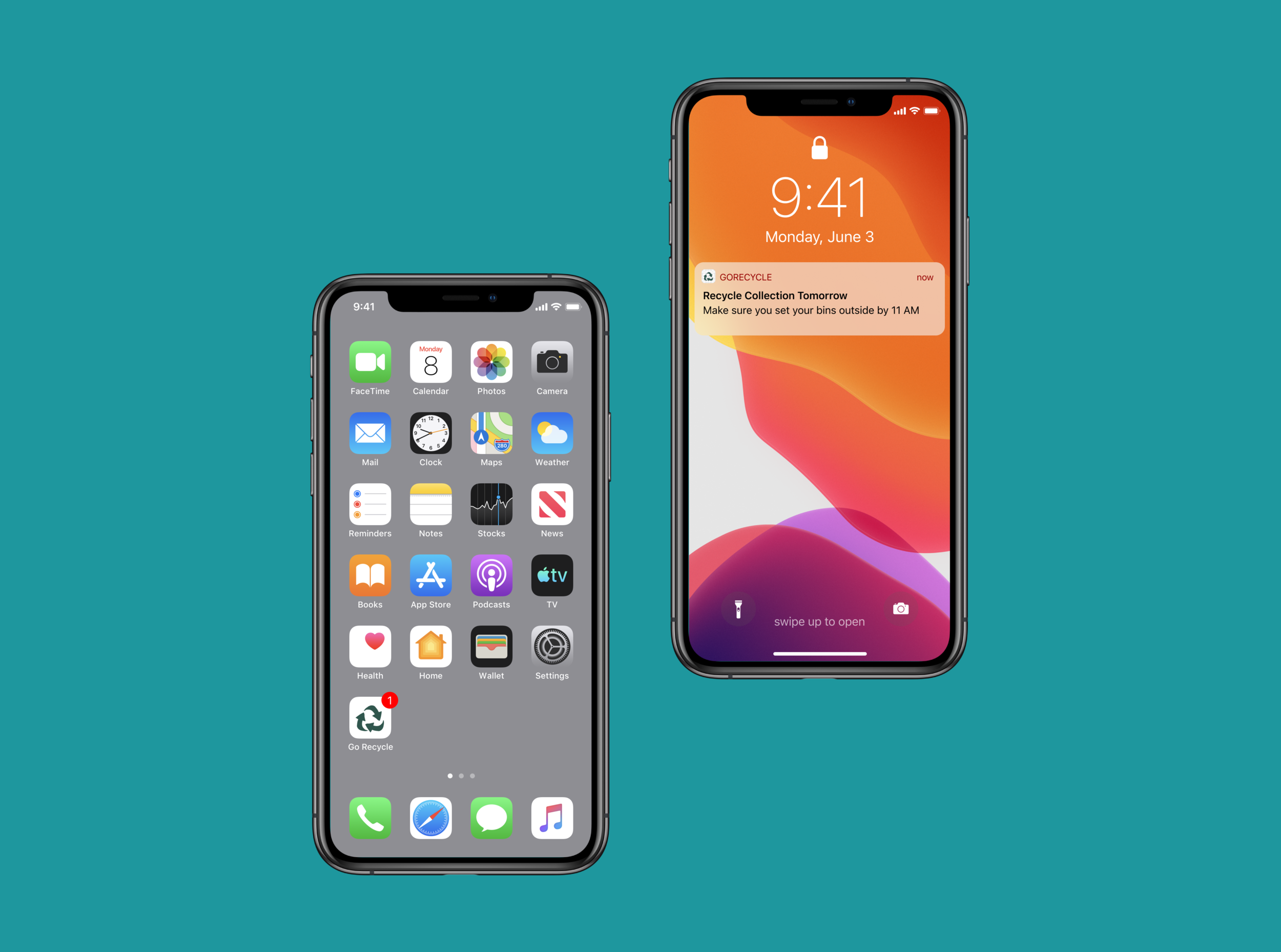
Go Recycle is a product that creates an easier experience for recycling. Users can identify what can and can’t be recycled.
How it works.
I wanted to bring excitement to this app by using after effects to my advantage.
Design
Process
1. RESEARCH
2. IDEATION
3. PROTOTYPE
4. SOLUTION
Goals
Product Goals
Creating an easier experience for recycling. Include a visual representation of filtered bins. Allow users to view the most common recyclable items.
Businesses Goals
Gain a small to large user base.
Reducing cost and time of re-sorting items at recycling centers. Make the user save money by realizing the cost of one-time-use items.
Tech Goals
Explore 3D
Drive fun Micro-interactions.
Create a Reuse. Reduce. Recycle. bond.
Synthesis and Clustering
Recycle Behavior
People don’t know in which bin each waste should be deposited.
People who recycle a lot still get confused with the recycle numbers on products
Recycling is a habit rooted in early education.
Pain Points
The lack of clear information.
Investing a lot of time and energy to separate the garbage.
Having to memorize in which bucket each waste goes
Living at school versus home.
RESEARCH
User Quotes
I struggle because I am a college student so when I am in California you can recycle glass bottles with all but when i’m in oregon it has to be separate. - Charlie
I need more education on the options when it comes plastic and compost, I always have no idea what the life cycle is for items here in oregon.
- DanI can remember what can and can’t be recycled, it would be nice to get a reminder when my recycle day is.
- Kali
Learning and Findings
User Prioritizing List
Lack of knowledge in their regional state.
People are reluctant to change their routines and introduce the habit of separating organic waste.
Cooking is the domestic activity where most waste is generated.
People make intensive use of smartphones during their daily activities (and when they cook they also have their phone next to them).
IDEATION
Feature Goals
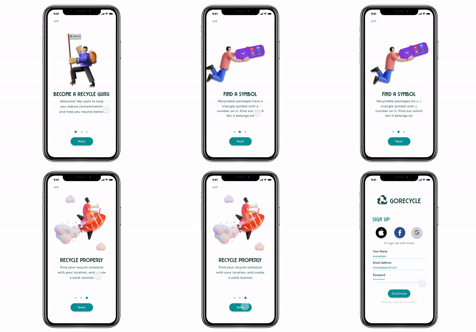
Mirco interaction On-Boarding
Find Location
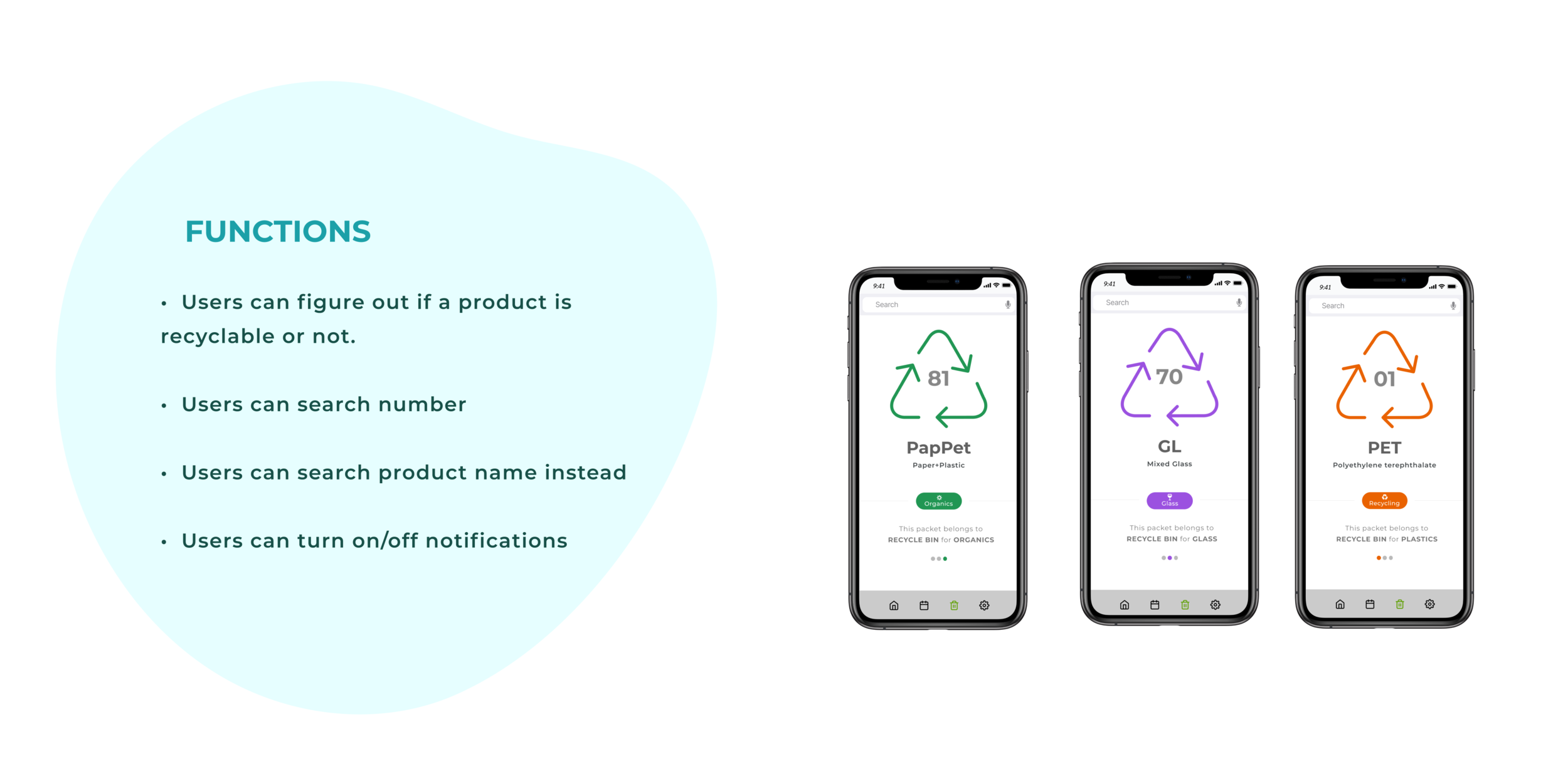
Use Recycle, Glass, Organic Bins
Push Notifications
Understanding Recycled Numbers
Search Number/ Items
Calendar Feature
Pick Your Own Location
Making the onboarding fun and informative.
Quick Motion Start
Testers were excited when seeing a fun little animation when loading the prototype, this caused the user to look forward to using the app.
Identifying users location feelings
Turn on location vs manual
Testers were a mix of people who don’t like sharing their location with apps and others who didn’t care and tend to click the allow one or allow only when using the app.
Live Prototype
Click on the right side menu tab to “scale to fit” to resize the prototype.
Take Aways.
What I learned
How to prototype faster and creating cohesive UI.
Understanding my users better by interviewing multiple users
If I had more time I would love to collaborate with a developer to create this in ios.
The importance of going in-depth with interviewing the users. Card sorting helped me a lot in visualizing the final product.
That I do not have to tackle all the problems to serve the users. Trying to focus on the highest priorities saved me a lot of time.


